Archive for Fonts & Typography Archives -
16 Free Fonts for Valentine’s DayValentine’s Day is coming up, and pretty soon we’ll be exchanging candies and printed Valentine’s Day cards with friends and significant others.
16 Free Fonts for the Holiday SeasonThe holidays are upon us, and so are holiday print projects! Whether you’re designing your corporate greeting cards or personal postcards, a festive font helps convey the mood of the season.
16 Free Fonts for Invitation DesignDesigning an invitation suite for a wedding, birthday party, corporate gala, or another special event? Typography and fonts will play a key role in your design!
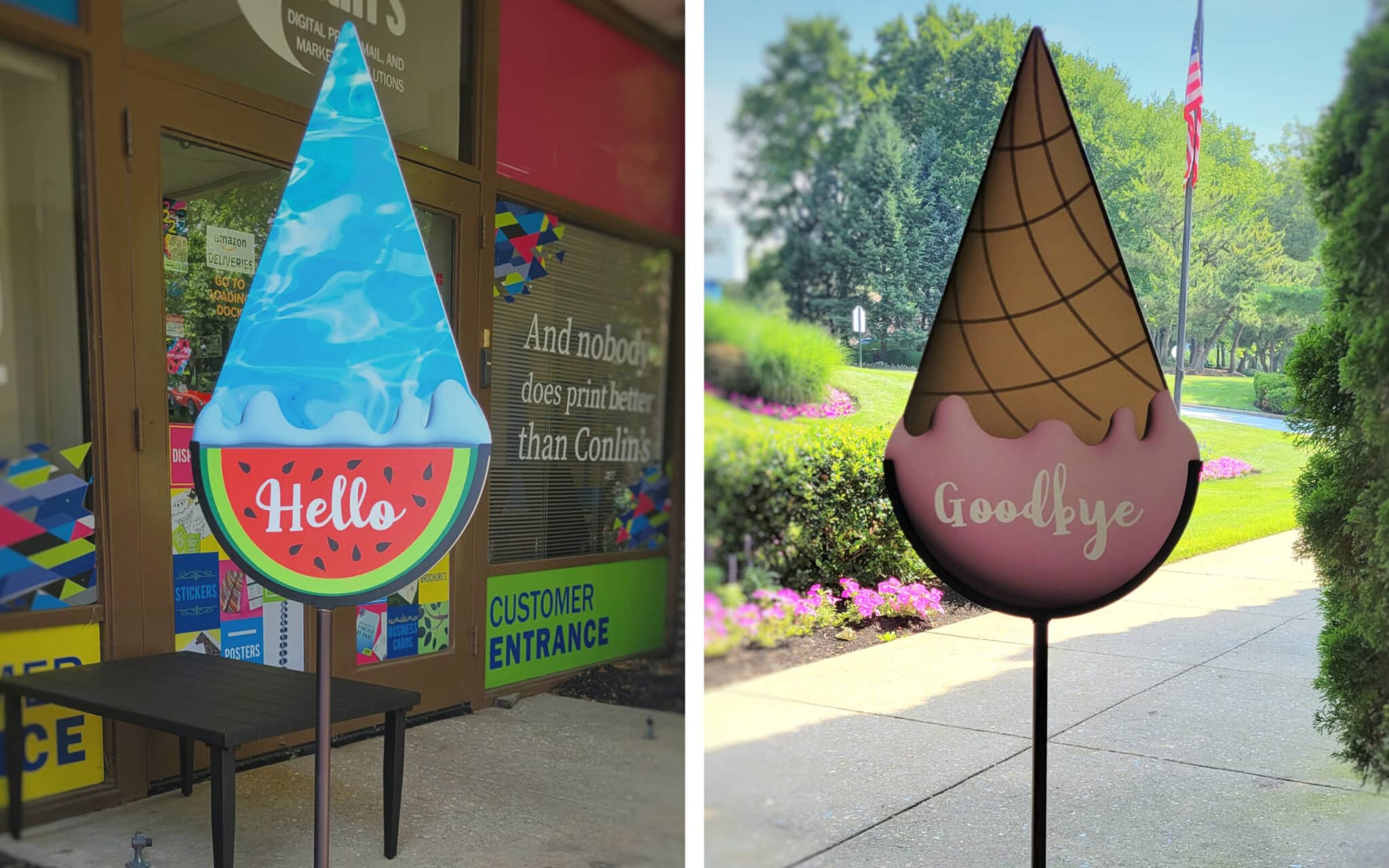
The Ultimate Guide to Designing Lawn SignsResearch from the United States Sign Council (USSC) states that it takes drivers one second to detect a sign on a busy street and another two to three seconds to read the message. With such a small window to grab their attention, it’s important that your lawn signs communicate your message clearly. Here are basic tips for how your signs can make an impression. Size & Readability When determining the size of your sign, as well as the size of your fonts, consider both the viewing distance and the speed limit of the area it will be placed in. If it’s going on a lawn in a quiet neighborhood where the speed limit is 25mph, the sign and it’s text can be smaller than if the sign were being placed on the side of a busy highway. The size most commonly used by our customers is 18″ x 24″. You can […]
The Ultimate Guide to Print DesignIf you’re a business owner, you spend a lot of time and money on your company’s printed materials. Paying careful attention to the design ensures that you put your best foot forward with every brochure, business card, or direct mail postcard. Here are our tips for ensuring that all of your print projects display top quality design for a great first impression. 1. Use good typography. Keep an eye on your font and font weights. The rule of thumb is to use no more than 2-3 fonts per project. To add variety, you can use different treatments within each family (bold, italic, etc.). Kerning and leading are important as well. Kerning is the character-spacing, or the spacing between the individual letters of your typography. Leading is the spacing between each line. Setting these too wide or too narrow will make your text less readable. 2. Select fonts that are easy […]