Archive for Prepress Archives -
Prepress 101: Tutorials Roundup (With Printable Checklist)Getting ready to send your files off to the printer? Setting up your print files properly can seem overwhelming, which it why we’ve rounded up all our prepress articles and shared them in a format that makes it easy for you to navigate them. The checklist below will carry you through each aspect of preparing your files and provides a link to the tutorial that corresponds with that topic. Don’t forget to swing by our Resource Library for a FREE printable version of this checklist to keep at your desk! IMAGES Prepress 101: How to Prepare Images for Print – 300 DPI/PPI resolution – Convert images to CMYK – Images are large enough to avoid pixilation – Vector files are best for logos, icons, and graphics – Images/graphics packaged with file or embedded FONTS – Proofread your work! – Package fonts with the file OR convert text to outlines – […]
Prepress 101: How to Set Up Design Files for Digital CuttingNote: This tutorial assumes a basic working knowledge of Adobe Illustrator. Our Zund Cutter is a great way to make customized signage, boxes, and cutouts. In order for the Zund to cut each job properly, we create a project file that contains lines that instruct the machine where to cut and where to crease the project. Our resource library provides templates for various boxes and signage, but many projects require custom templates (cardboard cutouts, signage, etc.). Creating this template isn’t too hard, but it’s important to understand the proper way to set up your artwork. Types of Cut Lines First, you’ll need to understand the four most common types of lines that our Zund Cutter can read. They are: Crease: Instructs the Zund Cutter to make a crease without cutting all the way through (on our cardboard box, this would translate to a fold line) Through Cut: Instructs the Zund […]
Prepress 101: How to Prepare Images For PrintWe’ve all experienced it – you (or your designer) spent time creating a beautiful print project. But when you get the proof back from the printer, you realize that your images don’t look so good. What seemed clear on the computer is pixelated on the paper. Or maybe the colors just aren’t quite as vibrant as they were on the screen. Luckily, these issues are easily avoidable. It all comes down to knowing how to prepare quality images for print. Here are three simple things to check when selecting and prepping images for your print projects: 1. Convert images to CMYK You’ll need to make sure that all images that you plan to use in your project are set to CMYK color mode. RGB color mode is typically the default, but this is best for photos that will be used on the internet. To optimize the colors in your print […]
Prepress 101: Creating Color Swatches for Print“Why doesn’t the color on my print project look the same as the color on the screen?” One of the most common errors in print design is the improper use of color settings in the design document. Colors can look completely different on the computer screen than they look printed. Colors can even vary from one computer screen to the next, depending on the model of the computer or the resolution of the screen. It’s important to use the proper settings for your color swatches. This will ensure that your colors are consistent on all of your printed materials. Here are a few need-to-know tips to help you get the results you are looking for! When it comes to printing, there are two types of colors: process colors and spot colors. Process Colors (CMYK) Process colors are regular CMYK swatches. CMYK stands for Cyan, Magenta, Yellow, and Key (black). This […]
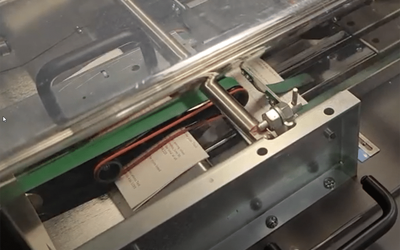
Prepress 101: Arranging Printer Spreads for Saddle Stitch Booklets (Infographic)Saddle stitch booklets are a popular and cost effective binding method that gives your projects a professional finish. To set up your design document properly for saddle stitch, there are a few tricks you’ll need to know. 1. The total page count needs to be divisible by 4 This booklet is basically a series of folded spreads stapled together. This means that the total page count needs to be divisible by four—otherwise you will have blanks at the end of your book. 2. Your pages will be ordered differently than with a regular booklet It seems natural to arrange your pages in order, but with this booklet type that will result in your pages being jumbled in the final product. For the pages to be in the proper order when the booklet is assembled, your design document will need the pages set up in a different order. If you are […]
The Ultimate Guide to Print DesignIf you’re a business owner, you spend a lot of time and money on your company’s printed materials. Paying careful attention to the design ensures that you put your best foot forward with every brochure, business card, or direct mail postcard. Here are our tips for ensuring that all of your print projects display top quality design for a great first impression. 1. Use good typography. Keep an eye on your font and font weights. The rule of thumb is to use no more than 2-3 fonts per project. To add variety, you can use different treatments within each family (bold, italic, etc.). Kerning and leading are important as well. Kerning is the character-spacing, or the spacing between the individual letters of your typography. Leading is the spacing between each line. Setting these too wide or too narrow will make your text less readable. 2. Select fonts that are easy […]
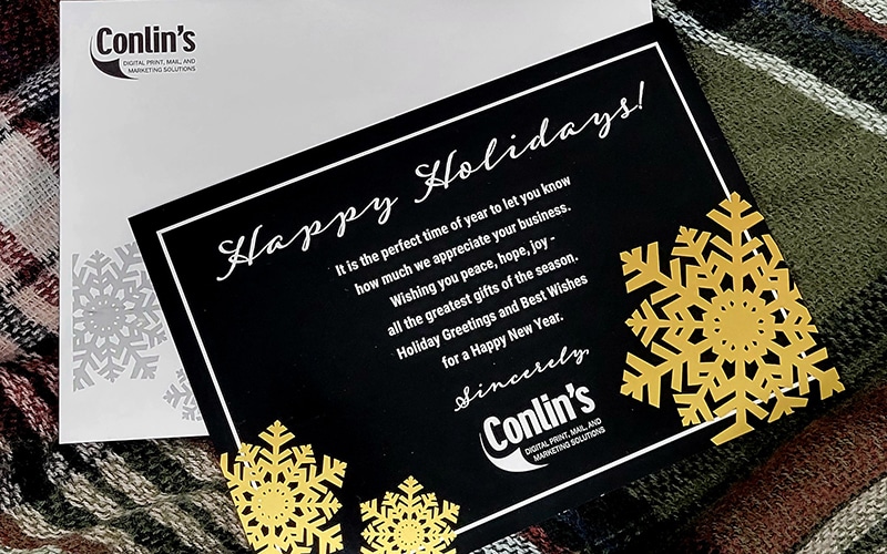
Prepress 101: How to Set Up Print Files for Metallic or White InkConlin’s is proud of the fact that we offer gold, silver, and white ink to take your print projects to the next level. A common question that our customers ask is, “How do I set up a document correctly when printing with this kind of ink?” It’s pretty simple, actually. Here’s a step-by-step guide to setting up a document for gold ink. The steps for silver and white are very similar and are explained at the end of the post. Setting Up for Gold Ink Important note before you get started: When designing your document, make sure that all of your gold text is in a separate content box than text that is being printed in a regular color. 1. Open the document that should be printed with gold ink. Display the Layers palette if it is not already open. (Window > Layers) 2. Click the New Layer button at […]
Prepress 101: Your Best Guide for Creating Print-Ready FilesSetting up your documents for the print might seem confusing, but it’s actually pretty simple. There are three important factors that go into creating a good print-ready file. They are: Margins & bleeds Image resolution Packaging your files Margins & Bleeds A common mistake in setting up documents for print is not building your margins or bleed into the design. As an example, lets say you are creating a poster that’s 8.5″ by 11″. Many people would submit a .PDF document that is exactly 8.5″ by 11″. The truth is, your document should actually output to a slightly larger size. To determine appropriate document setup, you’ll need to ask yourself the question will this project have a bleed? A bleed is when the ink goes to the edge of the printed area.