"Why doesn't the color on my print project look the same as the color on the screen?"
One of the most common errors in print design is the improper use of color settings in the design document. Colors can look completely different on the computer screen than they look printed. Colors can even vary from one computer screen to the next, depending on the model of the computer or the resolution of the screen.
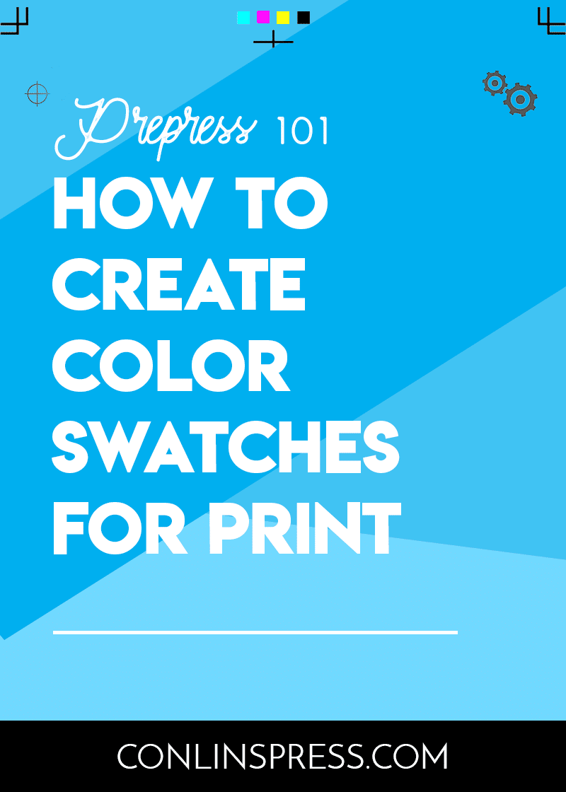
It’s important to use the proper settings for your color swatches. This will ensure that your colors are consistent on all of your printed materials. Here are a few need-to-know tips to help you get the results you are looking for!
When it comes to printing, there are two types of colors: process colors and spot colors.
Process colors are regular CMYK swatches. CMYK stands for Cyan, Magenta, Yellow, and Key (black). This is the color mode you’ll want to use for print projects. When designing for print, always double check that your color swatches are CMYK rather than RGB.
You’ll never want to use RGB color mode for print. RGB colors are for creating graphics for web – if you create a print document using these colors, they won’t match what you are seeing on the screen.
With spot colors, the color is applied to the print job using a single run. If a business card had two spot colors on it, then the job would need to be run twice to apply both colors to the card.
Spot colors are the best way to achieve color consistency across multiple print runs. They are not cost-effective for most jobs with multiple colors, but they are frequently used for marketing materials such as business cards. If your company’s branding colors are important, you may want to use a spot color to print your marketing materials so that your logo color doesn’t vary from job to job.
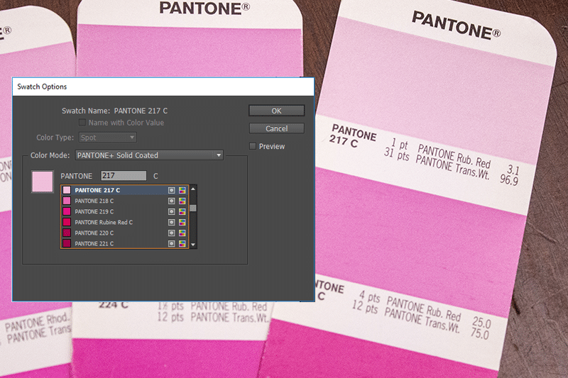
Pantones are the most commonly used spot color printing system in the United States. You can select from an entire library of pantone colors to match your company’s branding.
If you are using a spot color, make sure that you are using a color swatch from the Pantone color library and not a CMYK color. You’ll need to match the number from your chosen color to the number in the library.
When browsing your Color swatches, you’ll see “Registration” and “Black” as options (and both appear to be black). For print, you’ll want to choose Black instead of Registration.
Registration’s CMYK settings are Cyan - 100%, Magenta - 100%, Yellow - 100%, and Key (Black) - 100%. Black’s CMYK settings are Cyan - 0%, Magenta - 0%, Yellow - 0%, and Key (Black) - 100%.
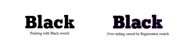
Because registration prints with three additional colors, you’ll run into problems with over-inking when you use it for print.
Plus instant access to our FREE template library!
Business is powered by print – and nobody does print better than Conlin’s!
![]()
![]()
![]()
![]()
©2024 Conlin's Print.
All rights reserved.


Comments are closed.