
If you’re a business owner, you spend a lot of time and money on your company’s printed materials. Paying careful attention to the design ensures that you put your best foot forward with every brochure, business card, or direct mail postcard.
Here are our tips for ensuring that all of your print projects display top quality design for a great first impression.
Keep an eye on your font and font weights. The rule of thumb is to use no more than 2-3 fonts per project. To add variety, you can use different treatments within each family (bold, italic, etc.).
Kerning and leading are important as well. Kerning is the character-spacing, or the spacing between the individual letters of your typography. Leading is the spacing between each line. Setting these too wide or too narrow will make your text less readable.

There are so many beautiful fonts out there. It’s easy to get carried away with the design and forget all about legibility. Cursive fonts are best used for invitations or items that are small and personal. For brochures, posters, direct mail, billboards – anything that needs to grab attention and communicate information quickly and clearly – choose a simple, clean serif or sans serif font for maximum impact.
Bonus tip: Avoid fonts that are cheesy or overused (Comic Sans, Papyrus, Times New Roman). Choose newer fonts like Avenir, Gotham, Futura, or Helvetica. You can find fresh new fonts by searching sites like fontsquirrel.com.
Knowing the difference between RBG (red, green, blue) and CMYK (cyan, magenta, yellow and black) is critical when submitting your packaged files to any printer. For print, any graphics you use need to be converted to CMYK.
Setting the correct image resolution and dpi for any raster or vector artwork is very important as well. The minimum recommended resolution for printing is 300dpi. Purchasing stock images is a great solution if getting high-quality photography isn’t an option. For more tips on making your images print-ready, check out our tutorial, Prepress 101: How to Prepare Images for Print.
If your artwork is meant to print to the edge of the page, you need to setup your bleeds properly. Forgetting to build in bleeds could result in printing delays. It is easier to set guides for trim, live area, and bleeds before you start working on your project. In doing so, you will avoid tiny white borders around the edge of the printed piece.
If your document doesn’t bleed, you’ll need to give it enough margin to ensure that no important information gets cut off in the finishing process. To learn more about setting up your document properly, check out our article, Prepress 101: Your Best Guide For Creating Print-Ready Files.
Color has the ability to communicate just as much as your words do. First, make sure you’re document is using the correct color mode. CMYK is the standard for print design, and RGB is for web design. Using the incorrect color mode can cause your printed product’s colors to vary from the colors you see on the computer screen.
Now that you’re using CMYK for print or RGB for web, you can get down to the fun part: using color to communicate. Visit our colors board on Pinterest to find color resources that we love.
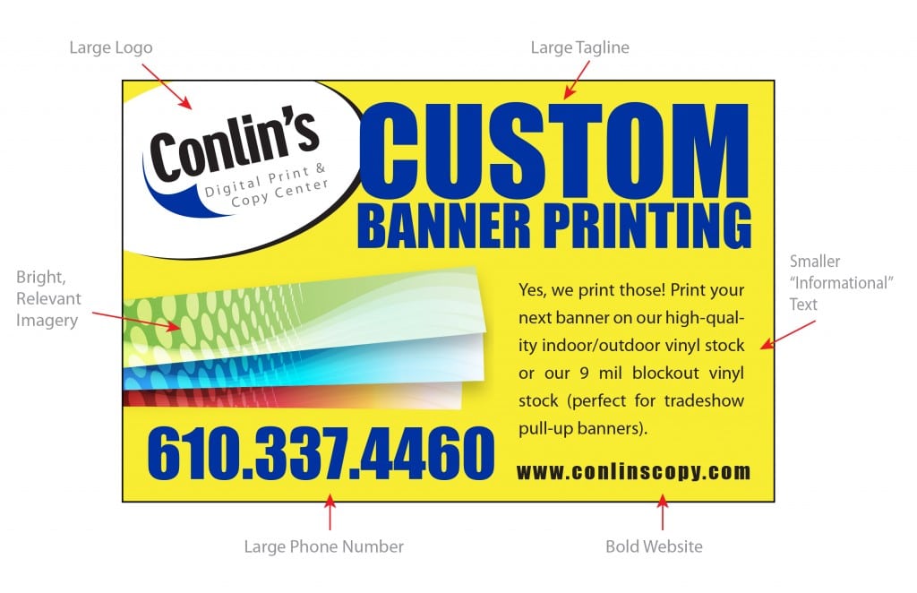
Remember to design with information hierarchy in mind. The more important information that you want the reader to remember should be larger, and clearly displayed (ie. business name, contact information, dates, title), while the remaining information can be smaller. A variation of font sizes breaks the information up in “chunks,” making it easier to read and more attractive.
Forgetting to proofread and spell check could lead to major problems for your printed project. There’s nothing worse than designing a beautiful piece only to realize that there are grammatical errors undermining your work. Take a moment to proof your own work carefully. Then, get a second (or third) pair of eyes to look over and approve the piece before you send it to the printer.
Always make sure to request an electronic or physical proof and have multiple people review it before giving the green light. It’s an important step to ensure that all of your materials are high-quality and error-free.
Plus instant access to our FREE template library!
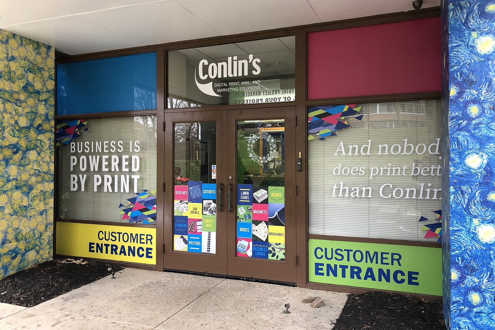
Business is powered by print – and nobody does print better than Conlin’s!
![]()
![]()
![]()
![]()
©2024 Conlin's Print.
All rights reserved.

Comments are closed.