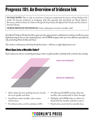
Our Xerox® Iridesse Production Press gives you the opportunity to add luxurious iridescent effects to your digital printing. It does so by combining four-color CMYK imagery with up to two different specialty dry inks, including Silver, Gold, and Clear.
The result is a shimmery and shiny finished product – all from a single digital print run!
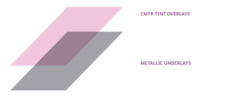
Each iridescent color is created by printing a silver or gold metallic underlay with a tinted color overlay.
Some colors work better with Iridesse than others. Take away the guesswork by using the pre-mixed swatches in the Iridesse Swatch Library. This is available when you download our Xerox Iridesse Resources. The zipped files contain an InDesign document called Master Metallic Color Swatch File Silver and Gold.indd, which has an entire library of metallic swatches.
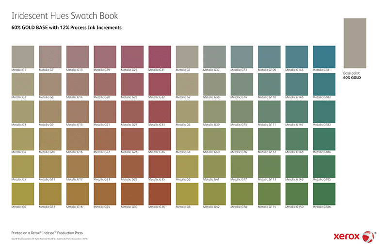
Iridesse project files look very different on the computer than they do when printed. Before you start designing, we recommend that you request a printed version of the swatchbook. This is a great design aide that will help you visualize the end result.
Note about Iridesse Colors: The swatches contained in the library are all CMY colors – meaning they don’t have black mixed in. Black tends to make the color turn out duller. It is possible to mix your own colors with black, so once you get the hang of it, you can definitely experiment with using black in your color mixes.
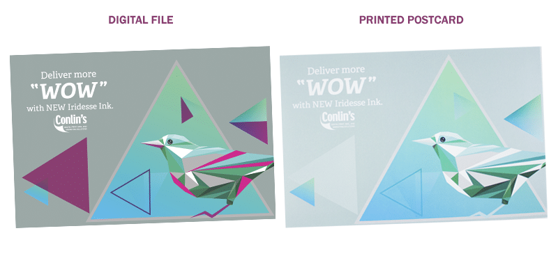
Now that you know a bit about creating the metallic colors, let’s take a look at a finished project: an Iridesse bird postcard. (Find this project in the Design & Prep Guide page 37)
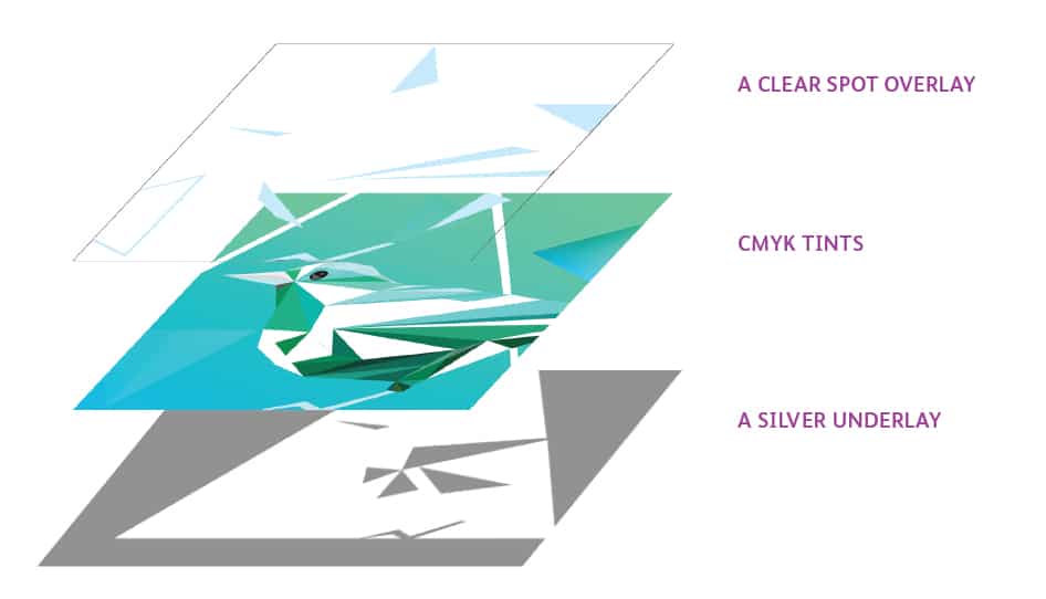
SILVER UNDERLAY
The first layer of this postcard is a silver underlay, set to 60%.
CMYK TINTS
The second layer contains CMYK tints, set to various levels of opacity. On this design, the background is comprised of pastel, iridescent colors while the bird is made of opaque, brightly saturated colors. Pairing a bright, non-metallic color with an iridescent one creates a beautiful contrast. Be sure to multiply each CMYK object.
CLEAR SPOT OVERLAY
The third layer contains a few spots of clear ink. When printed over Iridesse ink, clear ink creates a “dull” effect that contrasts with the shine of the metallic colors. Clear objects must be set to Overprint.
PAPER SELECTION
With Iridesse, your paper selection can affect your design. Coated paper is the best choice to make this ink pop.
If something is wrong with your file, double-check these things:
This tutorial only scratches the surface of what’s possible with Iridesse Ink. To learn more about the full range of possibilities, download our Xerox Iridesse Resources. This kit contains two guidebooks, four swatchbooks, and the swatch library.
Download Xerox Iridesse Resources
Our Iridesse colors look their best in person, and the design files look different on the computer than they do when printed! We recommend that you request a printed version of our swatchbooks, which will help you visualize the end result.
Plus instant access to our FREE template library!
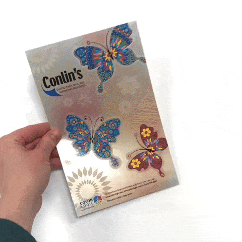
Business is powered by print – and nobody does print better than Conlin’s!
![]()
![]()
![]()
![]()
©2024 Conlin's Print.
All rights reserved.


Comments are closed.