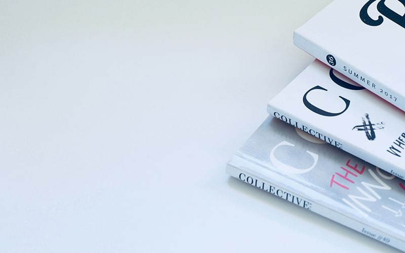
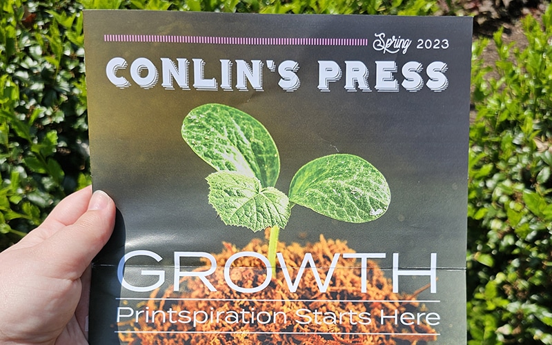
A solid publication starts with great content that engages the mind. Then you need beautiful images. Whether they are photographs or illustrations, they should support your content and inspire the reader. Typography and layout design are important, too. Your layout serves as a “tour guide”, leading your reader through the content. A good layout makes a book a pleasure to read and adds value to the content.
These design elements are vital to the success of your finished piece. But this is a print publication, and the design work isn’t done once your design file has been set up. You still have some important decisions ahead of you, and they all fall into the hands of — you guessed it — your printer!
Making the right choices at the printer can take your design from great to WOW! To make your publication as impressive and reader-friendly as possible, we’ve created this handy guide to take you through the print design process.
There are five important elements of print publication design:
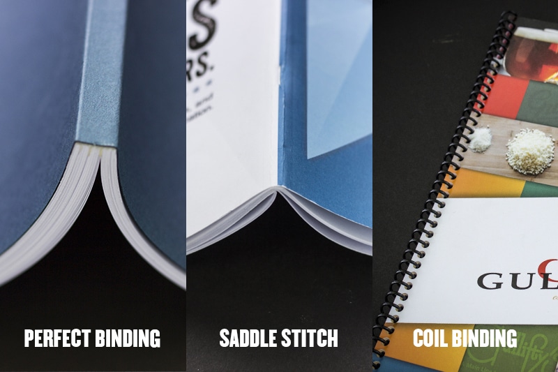
The right binding can improve the look and functionality of your finished project. I'm not going to go over each and every binding type that we offer, because we've already done that! Check out our infographic on choosing the best binding if you'd like to know the ins and outs of each type.
When designing a publication, you'll most likely choose perfect binding, saddle stitch, or coil binding.
Usability and appearance should be your most important considerations in your design. Here are some tips to help you pick the best option:
✔ Perfect binding is a classic choice for books. It’s easily the most professional finishing option and can accommodate a high page count. It’s the best choice for projects with a long lifespan, such as novels, children’s books, yearbooks, and coffee table books.
✔ Will there be multiple volumes? Perfect bound books allow you to print on the spine, which makes your books easy to browse when displayed on a shelf.
✔ Saddle stitch books are less expensive and easier to put together. This makes them a popular choice for magazines, catalogs, or seasonal look books.
✔ Consider the size of your document when selecting your binding type. A saddle stitch booklet has a limit of approximately 200 pages, depending on the thickness of the stock that you choose.
✔ Does the book need to lay flat? Saddle stitch books lay flat, which lends to their readability. You won't lose bits of the page or have the problem of your book being hard to read comfortably. Our perfect bound books also have lay-flat capabilities, but factors like stock thickness, the number of pages, and lamination can affect how well this works. Even with lay-flat capabilities, saddle stitch and perfect binding usually need to be weighted down to stay open. If the book is meant for leisurely reading, that's not a problem at all. But if it's a cookbook, a craft book, or something else where the reader will be multi-tasking, then a coil bound book is a perfect hands-free option.
✔ Bonus tip: If you are designing a cookbook, consider laminating the pages, or at least choosing a sturdier high-gloss stock. Your user will likely be using this while covered with flour, sauce, or some other kind of food, and thin uncoated stock will easily pick up stains or liquid.
There are endless paper stocks for you to choose from – and if Conlin’s doesn’t stock what you are looking for, we can place a special order for you. It would be impossible to show you the full range of possibilities, because there are just too many.
When choosing your stock, keep a few factors in mind:
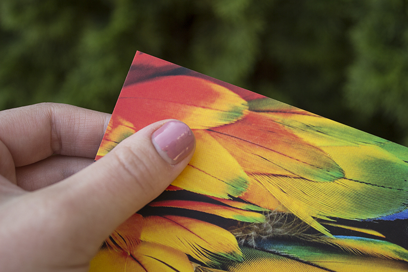
Coated paper makes images pop, while uncoated paper produces a slightly duller image. This is because the gloss coating makes the paper less absorbent, so the ink will sit on top of the paper producing a more vibrant image. Using uncoated paper in publication design is trendy right now, and it can produce beautiful results. However, if photography is central to your publication, consider a coated stock for the strongest images.
If your book is intended for writing or drawing in, you need to use matte stock. I made the mistake of printing out a coloring page without specifying my stock choice, and it got printed on high-gloss paper. Crayons and colored pencils don't work on glossy pages! Now I always remember to communicate clearly about which stock I need when I request my print job.
In general, you’ll want to select a thick cover stock with inner pages of a lighter weight. Not always though – items like a saddle stitch magazine often have a “self cover”, where the inner pages and cover are the exact same stock.
The stock thickness is mostly a design choice that depends on the desired look and feel of your book. But don’t forget to consider:
✔ Your project lifespan. Is this a book that people will keep on their coffee table, or a look book that might get tossed once a purchase decision has been made? Choose higher quality stocks for longevity and lower quality ones for items that are disposable.
✔ Return on investment. Sometimes, it does make sense to invest in quality, even for something that might get tossed. If your book needs to impress a client that could potentially bring in a $1 million dollar sale, then the higher cost of your materials is offset by the return. On the other hand, a local boutique advertising their spring collection through a direct mail catalog should stick to lower cost materials.
A specialty stock on the cover can lend a more professional feel. They typically cost a bit more, so once again, you’ll want to consider your project’s lifespan and return on investment if you spring for something fancy.
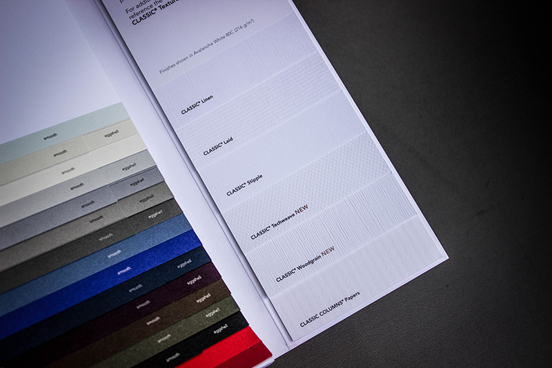
Our stock sample book (pictured below) has specialty textures that include linen, laid, stipple, techweave, and woodgrain. Cotton is another popular specialty stock option.
Your size and shape is partially a design choice and partially determined by your purpose and content. Here are a few points to keep in mind:
✔ Is this item being mailed? You may want to select a format that fits into one of the standard direct mail size categories to avoid overspending on postage.
✔ Is your written content central to the design? A smaller, standard book size will make reading easier on the eyes. With a larger format, you’ll need to arrange your text in columns to maintain readability. Plus, if it's a novel you'll want it to fit easily on a bookshelf with other books.
✔ Is photography central to the design? A larger size with lay-flat pages shows the details in your photos and makes it easier to browse. Larger formats are great for coffee table books, as readers may want to display them prominently for guests to peruse.
To add a that finishing touch to your project, try a specialty ink! Conlin’s can print with white, metallic gold, or metallic silver ink. Check them out and learn how to add them to your print document with this tutorial.
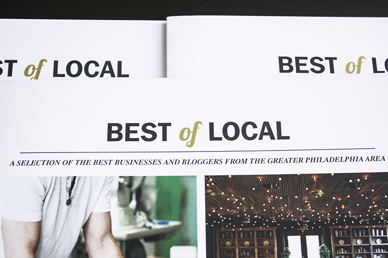
Our Best of Local magazine uses a hint of gold ink on the cover to add interest.
Lamination is great because not only does it add tactile interest – it also protects your piece and improves the durability. As mentioned earlier in this post, if you are making a cookbook (or a menu, for that matter) you may want to laminate it to protect it from spills.
There are tons of lamination options, but it really comes down to whether you want your finish to be matte or glossy. Beyond that, there are a variety of thicknesses to choose from. And then there are a few specialty laminates. My personal favorite is our soft-touch Velvet Matte Lamination. Just as the name describes, it lends a soft finish to the entire cover that is pleasing to the touch.
Our Best of Local magazine that we mailed to customer last year featured Velvet Matte Lamination on the cover. We printed out multiple versions of this before deciding on the final piece, and I can tell you that the velvet finish had a huge impact on the perception of the book.
The versions without laminate looked great, but when you first feel that velvet under your fingertips, it really grabs your attention. You want to keep feeling the velvet, and that extra time spent holding the book could be the difference between reading it or putting it back down. This is just one of the many reasons why print is so powerful and will always have it's place, even in a digital world.

Plus instant access to our FREE template library!
Business is powered by print – and nobody does print better than Conlin’s!
![]()
![]()
![]()
![]()
©2024 Conlin's Print.
All rights reserved.

Comments are closed.