Research from the United States Sign Council (USSC) states that it takes drivers one second to detect a sign on a busy street and another two to three seconds to read the message. With such a small window to grab their attention, it’s important that your lawn signs communicate your message clearly.
Here are basic tips for how your signs can make an impression.
When determining the size of your sign, as well as the size of your fonts, consider both the viewing distance and the speed limit of the area it will be placed in. If it’s going on a lawn in a quiet neighborhood where the speed limit is 25mph, the sign and it's text can be smaller than if the sign were being placed on the side of a busy highway.
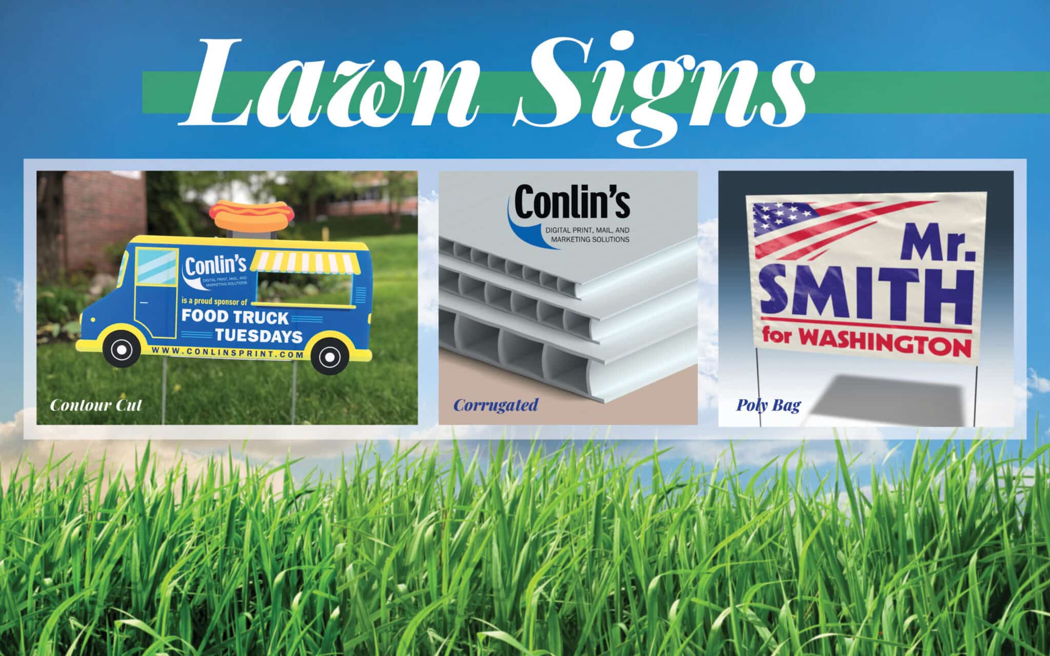
The size most commonly used by our customers is 18" x 24". You can opt for an oversize sign if you need additional visibility. The chart below shows the suggested letter height based on the speed limit.
| Speed | Letter Height |
|---|---|
| 25 mph | 7" |
| 30 mph | 10" |
| 35 mph | 11" |
| 40 mph | 13" |
| 45 mph | 14" |
| 55 mph | 16.5" |
Find more details on optimal sign and font size in USSC's Sign Legibility Rules of Thumb.
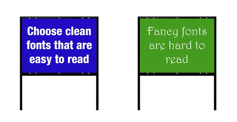
Be sure to choose fonts that are easily legible from a distance. Fancy fonts can be great for invitations or other hand-held items, but with a lawn sign, getting your message across quickly is important. As mentioned before, your sign will hold the viewers attention for about four seconds total. You don't want them to waste any of that time on trying to interpret an unclear font. Clean and bold sans serif typefaces are usually the best option.
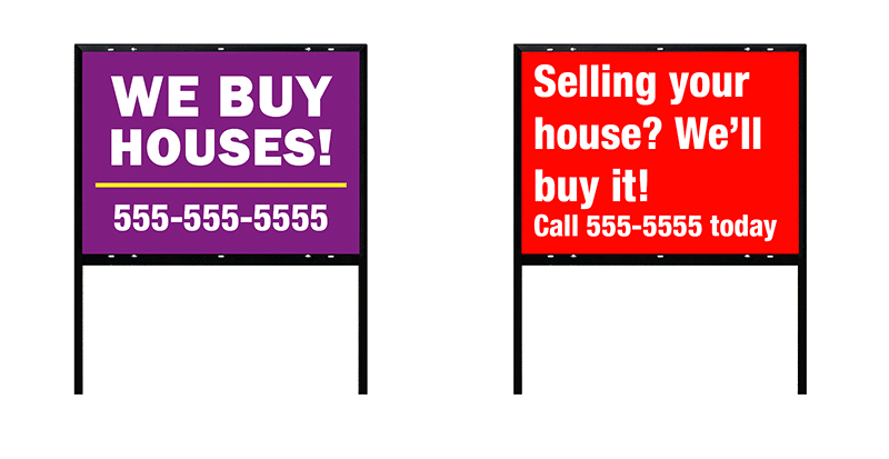
Managing the space between and around the sign elements and text makes it easier for readers to interpret your message. A crowded sign is sloppy and difficult to read. Use clear and concise language and make sure important information (like the phone number or call-to-action) stands out.
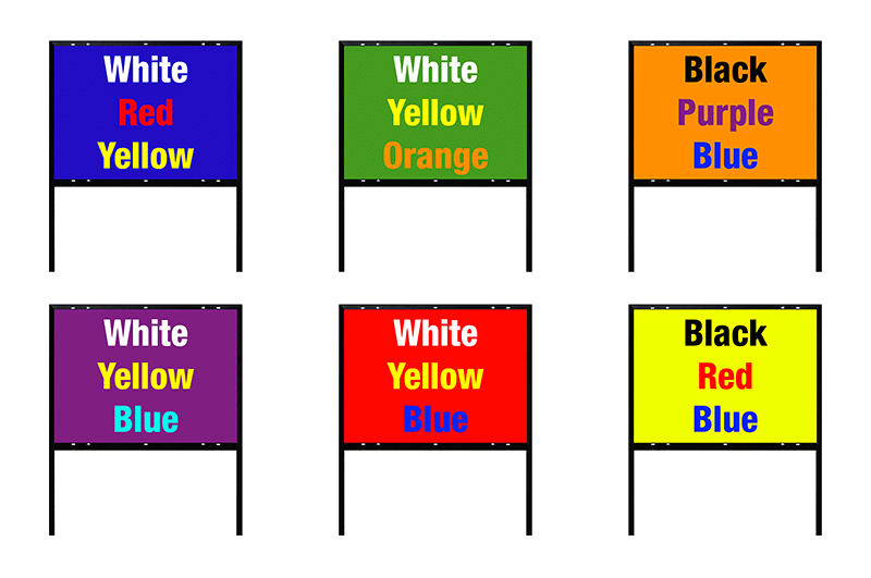
Avoid soft colors and instead opt for bright, saturated ones. These will make your sign pop. It’s also important that your text and background color are contrasting. Contrasting colors tend to be on opposite sides of the color wheel.
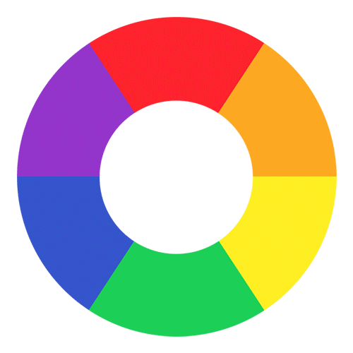
Here are a few examples of contrasting color combinations. This is not exhaustive – just a starting point!
Click here to learn more about the signage options available at Conlin's.
Plus instant access to our FREE template library!
Business is powered by print – and nobody does print better than Conlin’s!
![]()
![]()
![]()
![]()
©2024 Conlin's Print.
All rights reserved.

Comments are closed.