Archive for Print Design Archives - Page 2 of 3 -
Prepress 101: Creating Color Swatches for Print“Why doesn’t the color on my print project look the same as the color on the screen?” One of the most common errors in print design is the improper use of color settings in the design document. Colors can look completely different on the computer screen than they look printed. Colors can even vary from one computer screen to the next, depending on the model of the computer or the resolution of the screen. It’s important to use the proper settings for your color swatches. This will ensure that your colors are consistent on all of your printed materials. Here are a few need-to-know tips to help you get the results you are looking for! When it comes to printing, there are two types of colors: process colors and spot colors. Process Colors (CMYK) Process colors are regular CMYK swatches. CMYK stands for Cyan, Magenta, Yellow, and Key (black). This […]
3 Simple but Powerful Ways to Engage Your Audience with Direct MailDirect mail presents a real opportunity for brands. As we shared in our post, 4 Reasons Why Direct Mail Belongs in Your Marketing Mix, one of the benefits of direct mail is the ability to catch and hold your recipient’s undivided attention. The key to grabbing hold of this benefit is to create a piece that is engaging. The more time your recipient spends reading, viewing, or interacting with your mailer, the better chance you have of staying in their long-term memory. So how do you foster engagement? Here are three tried-and-true methods that are simple but effective. 1. Share a sample of your product Not only is this a great way to show off what you can do, but it can also add visual and tactile interest to your mailer. This trifold mailer contains a free sample of our removeable vinyl label. The label, which has our logo, website, […]
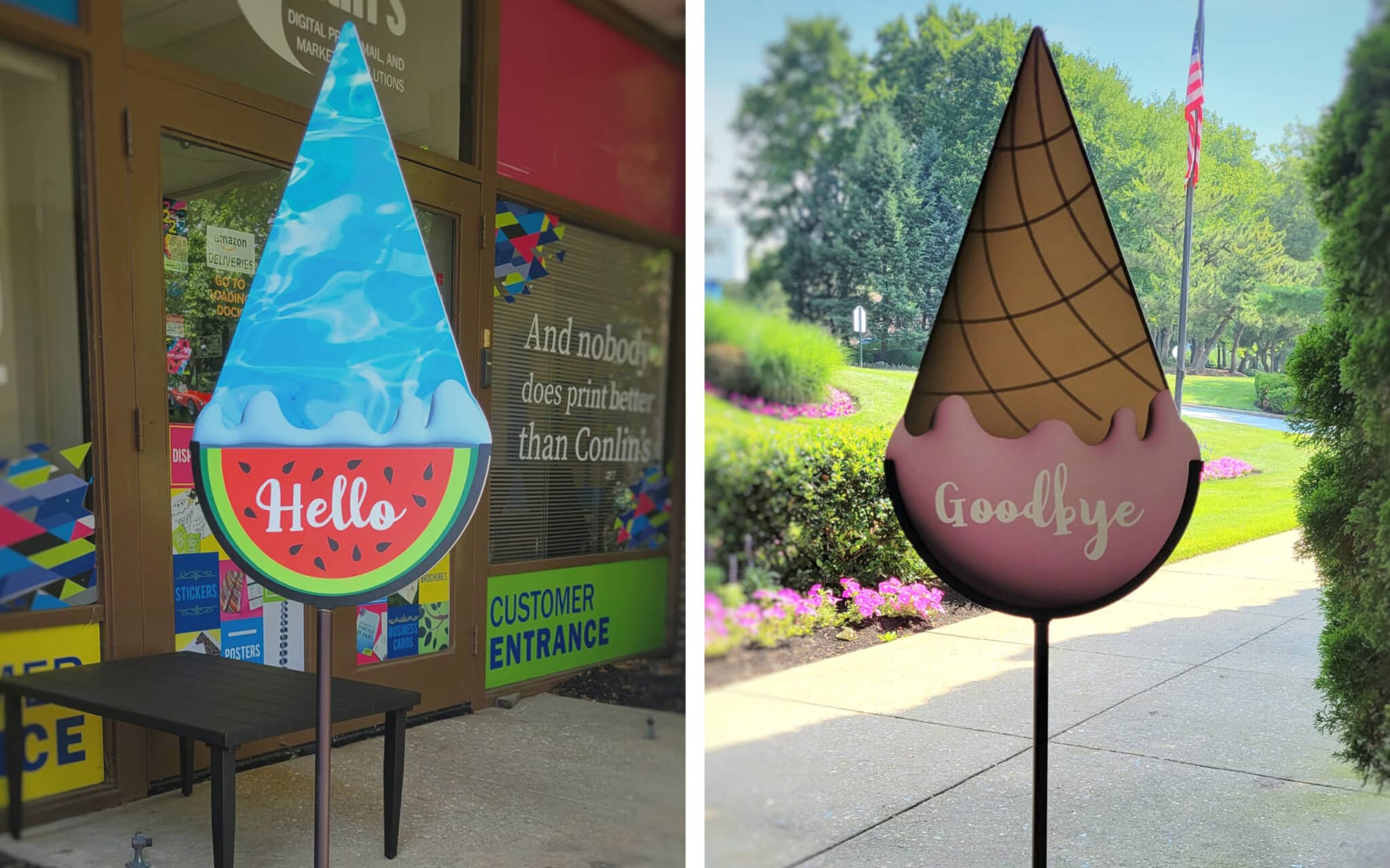
The Ultimate Guide to Designing Lawn SignsResearch from the United States Sign Council (USSC) states that it takes drivers one second to detect a sign on a busy street and another two to three seconds to read the message. With such a small window to grab their attention, it’s important that your lawn signs communicate your message clearly. Here are basic tips for how your signs can make an impression. Size & Readability When determining the size of your sign, as well as the size of your fonts, consider both the viewing distance and the speed limit of the area it will be placed in. If it’s going on a lawn in a quiet neighborhood where the speed limit is 25mph, the sign and it’s text can be smaller than if the sign were being placed on the side of a busy highway. The size most commonly used by our customers is 18″ x 24″. You can […]
Prepress 101: Arranging Printer Spreads for Saddle Stitch Booklets (Infographic)Saddle stitch booklets are a popular and cost effective binding method that gives your projects a professional finish. To set up your design document properly for saddle stitch, there are a few tricks you’ll need to know. 1. The total page count needs to be divisible by 4 This booklet is basically a series of folded spreads stapled together. This means that the total page count needs to be divisible by four—otherwise you will have blanks at the end of your book. 2. Your pages will be ordered differently than with a regular booklet It seems natural to arrange your pages in order, but with this booklet type that will result in your pages being jumbled in the final product. For the pages to be in the proper order when the booklet is assembled, your design document will need the pages set up in a different order. If you are […]
4 Things Signs & Banners Will Do For Your BusinessDon’t make the common mistake of underestimating the value of your company’s signage. Signs are one of the most powerful methods of conveying a message to your customer. Your signs say who you are and what you do. They help make important associations that your customers need to make in order to recognize their need for your service. “Why do signs sell? Because someone is passing a message to us, and we don’t even realize it. Signs change our attitudes and the way we think.” [Why Signs Sell] If you haven’t already given thought to updating your office, now is the time! Here are four things that signs and banners can accomplish for your company. 1. Educate your market Chances are, your customers might not know much about the products and services you offer. Signage is an opportunity to provide them with education in a way that’s subtle and not […]
5 Tips for Business Card DesignFirst impressions are important, especially when you are prospecting new clients. Contribute to a positive first impression with a well-designed business card. Here are five design tips to help you get started! 1. Use good design principles. Make sure that your logo, type, and all content are clearly legible. Avoid overcrowding the card – negative space makes your design easier on the eye. For a professional result, spend a little of your budget and work with a professional designer! 2. Get creative, but stick to the standard size. It can be tempting to create different shapes and sizes of business cards, but practicality is just as important as creativity. If your card doesn’t fit in a wallet or card holder, it runs the risk of getting tossed. A standard card is 3.5″ x 2″ – this will fit in standard business-card holders. To make your card stand out, you can […]
Conlin’s 2016 Norman Rockwell CalendarCalendars are one of the best marketing items your business can create.
4 Keys to Creating an Effective Leave-Behind PieceA “leave-behind” piece is a printed material that, as the name implies, you “leave behind” with a potential customer. The main purpose of this piece is to raise brand-awareness so that your company is the one that comes to mind when that person needs your product or service. Here are four keys for creating an effective leave-behind for your business. 1. Make It Useful Brochures and business cards are effective tools, but they also frequently get tossed (especially if your recipient isn’t currently in need of the services you offer). A strong leave-behind piece has some sort of utility. Magnets, pencil cups, and calendars are all items that your customer can put to use. 2. Include Your Logo and Contact Info Now that we’ve established that your piece is something your customer will keep, don’t forget to put your logo and contact info on there! It doesn’t have to be […]
The Ultimate Guide to Print DesignIf you’re a business owner, you spend a lot of time and money on your company’s printed materials. Paying careful attention to the design ensures that you put your best foot forward with every brochure, business card, or direct mail postcard. Here are our tips for ensuring that all of your print projects display top quality design for a great first impression. 1. Use good typography. Keep an eye on your font and font weights. The rule of thumb is to use no more than 2-3 fonts per project. To add variety, you can use different treatments within each family (bold, italic, etc.). Kerning and leading are important as well. Kerning is the character-spacing, or the spacing between the individual letters of your typography. Leading is the spacing between each line. Setting these too wide or too narrow will make your text less readable. 2. Select fonts that are easy […]
Conlin’s “Best of Local” MagazineWe wanted to create a direct mail piece that would grab people’s attention.
Prepress 101: How to Set Up Print Files for Metallic or White InkConlin’s is proud of the fact that we offer gold, silver, and white ink to take your print projects to the next level. A common question that our customers ask is, “How do I set up a document correctly when printing with this kind of ink?” It’s pretty simple, actually. Here’s a step-by-step guide to setting up a document for gold ink. The steps for silver and white are very similar and are explained at the end of the post. Setting Up for Gold Ink Important note before you get started: When designing your document, make sure that all of your gold text is in a separate content box than text that is being printed in a regular color. 1. Open the document that should be printed with gold ink. Display the Layers palette if it is not already open. (Window > Layers) 2. Click the New Layer button at […]
The Ultimate Guide to Brochure DesignEven in the digital age, printed brochures and “leave-behind” pieces are still an important part of every business’s marketing mix. But is your company brochure actually selling your products and services, or is it getting tossed aside? Here are our best tips to ensure that your brochure is getting the job done! 1. Ask yourself the right questions. Don’t piece together your brochure without first considering what you want it to accomplish. By asking the following questions, you’ll be able to set a goal in your mind and design content aimed to push the reader toward a specific action, such as calling for a quote, visiting your website, or inquiring about a new product. What is the purpose of the brochure? Who is your audience? Is the brochure design consistent with your brand’s identity and voice? What is the main message and call to action? 2. Plan your content. Keep in […]